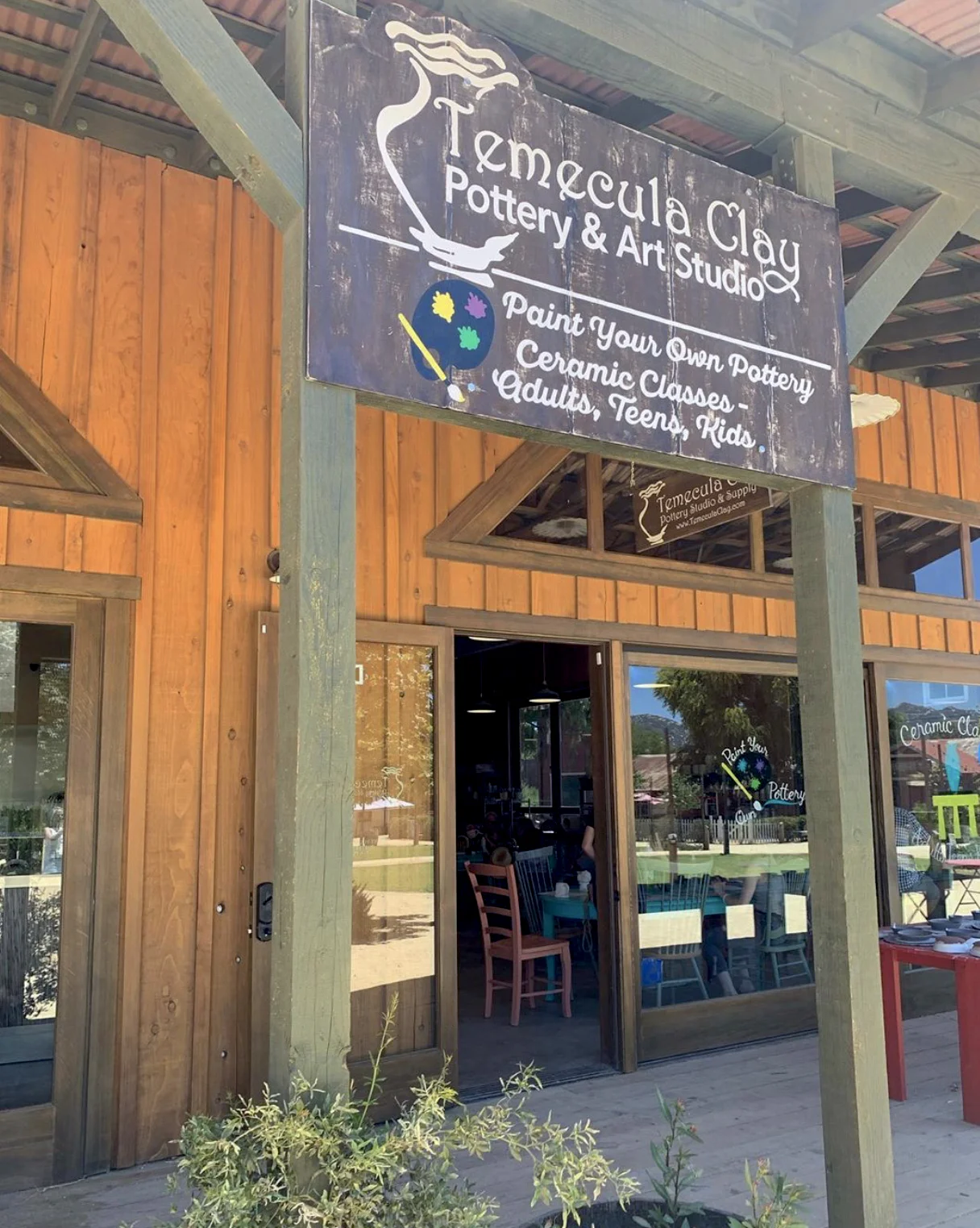
HOW IT WAS DONE - DISTRESSED BACKGROUND HAND PAINTED STOREFRONT SIGN
Here is a recent project — a storefront sign to fit into a local funky-style shopping/food center. The client, Temecula Clay Pottery and Art Studio, is located in the Vail Headquarters in Temecula, near San Diego CA.
The instant-aged look and hand painted graphics helps the sign fit into the style of the location.
I started with MDO plywood, a sign panel product that has smooth fiber product facing laminated to the plywood, then painted with primer and enamel for a very durable surface. The shape was cut out, and faux plank grooves cut in. The sign is about 5 ft-10 in wide, 3 ft-4 in high.
Next, the panel itself gets distressed — in this case, I beat it just a bit with a chain and lock. Gotta do what you gotta do!
After that, the base paint color was rolled on.
Next came the wood graining, and faux plank lines, done by hand with enamel paints. Enamels are durable outdoors, also slower to dry so blending colors is easier.
But that was too new-looking. So, next comes the sandpaper!
Here is a photo along the way to the finished product…
After some more sanding, I hand painted the graphics. Readability is very important to me, so this becomes a balancing act between the distressed look and feel of the background and the graphics. I chose to not do any aging effects on the graphics themselves so the sign would be quickly readable.
Below — the final hand painted and distressed sign, ready for client to install, and installed in its final location:
You might be thinking about getting this kind of project done, Do you know where to start? I can tell you - contact me, Paul Borne (president of Big City Signs) to find out more.
Please subscribe to our newsletter at this link for updates! (No spam, I promise!)
Big City Signs | Graphics - since 1981… Old School Know-How & Today’s Technology.


